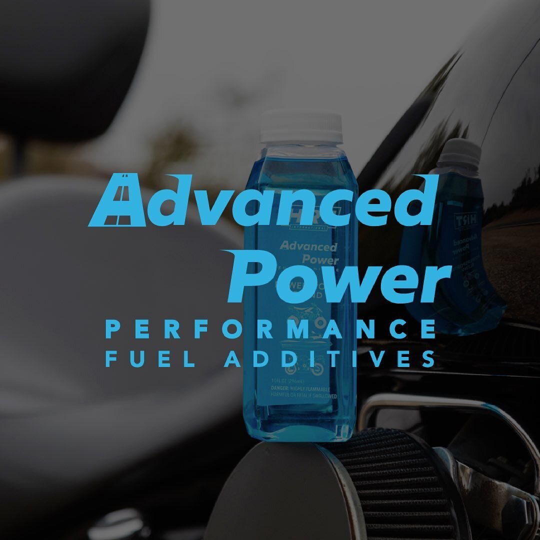
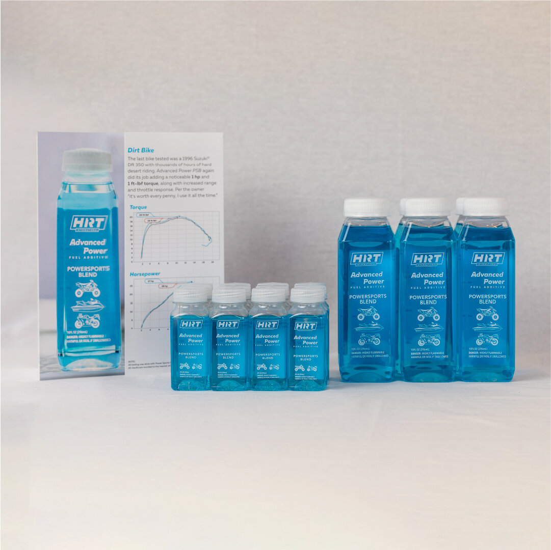
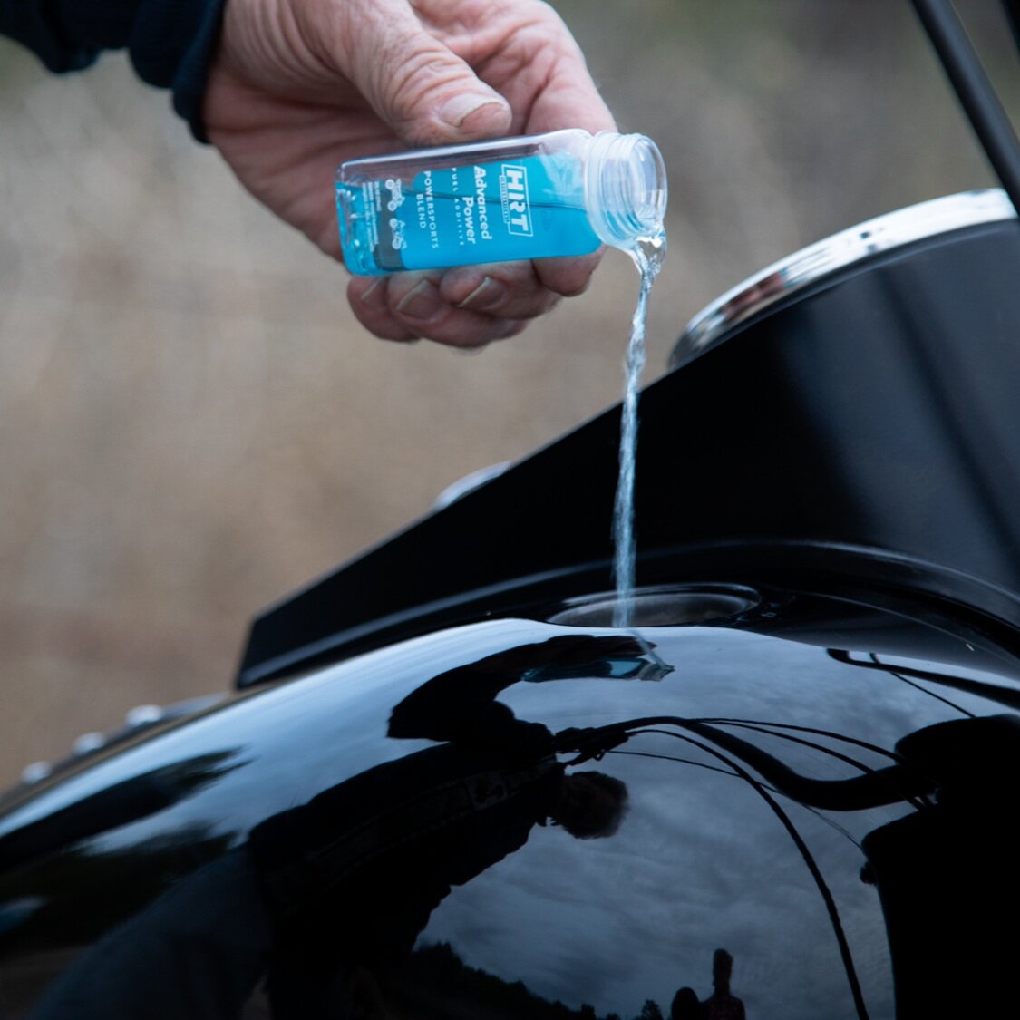
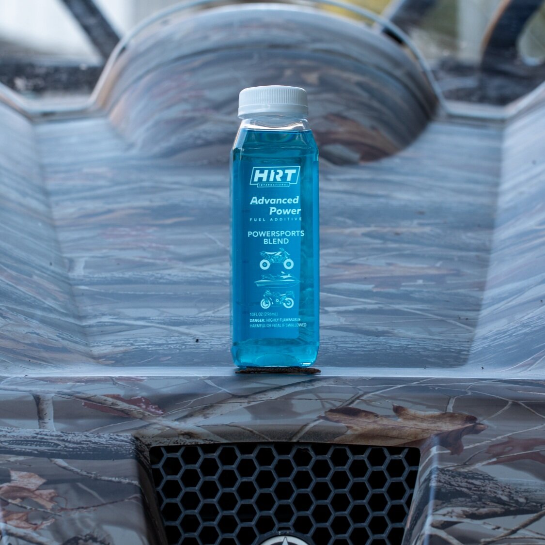
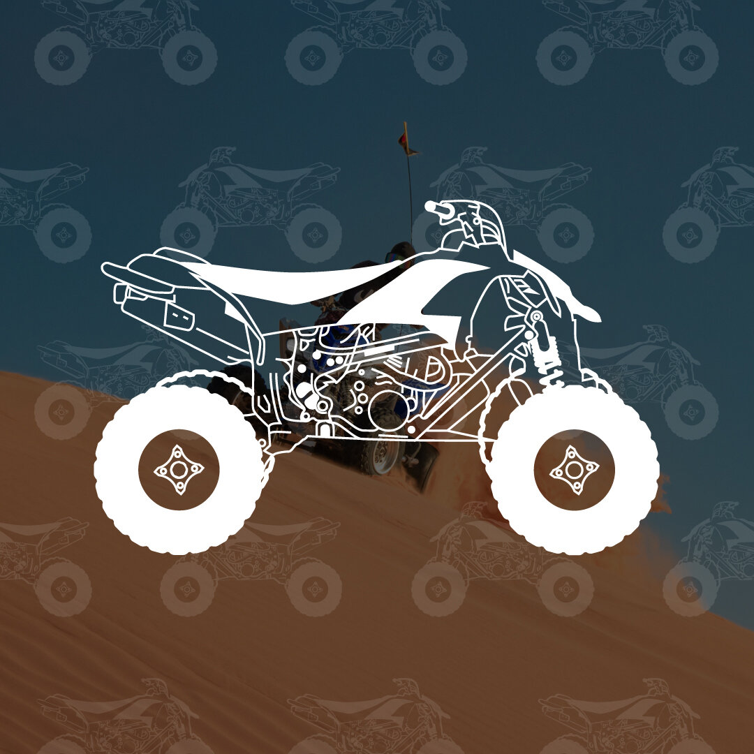
Advanced Power Performance
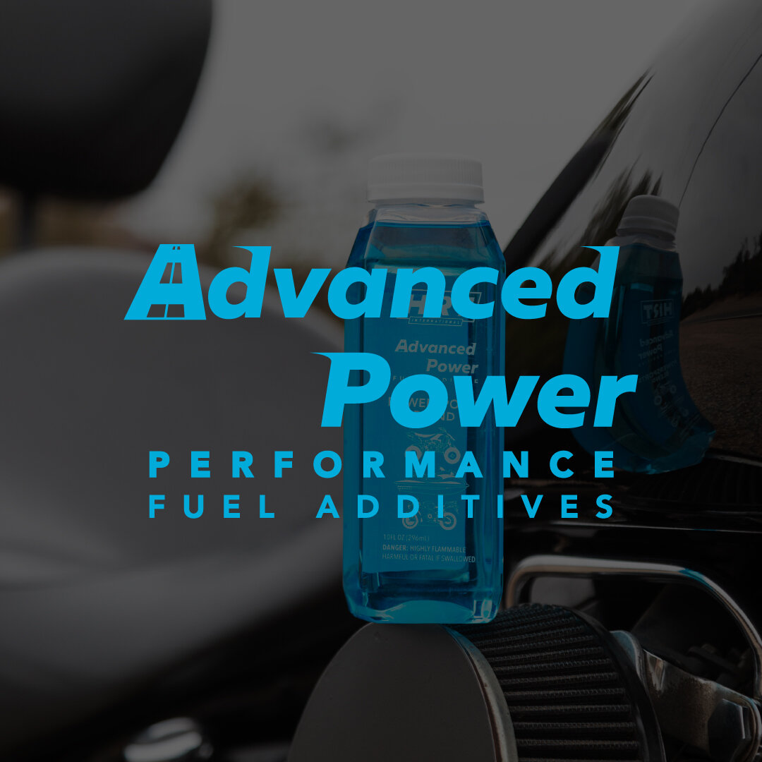
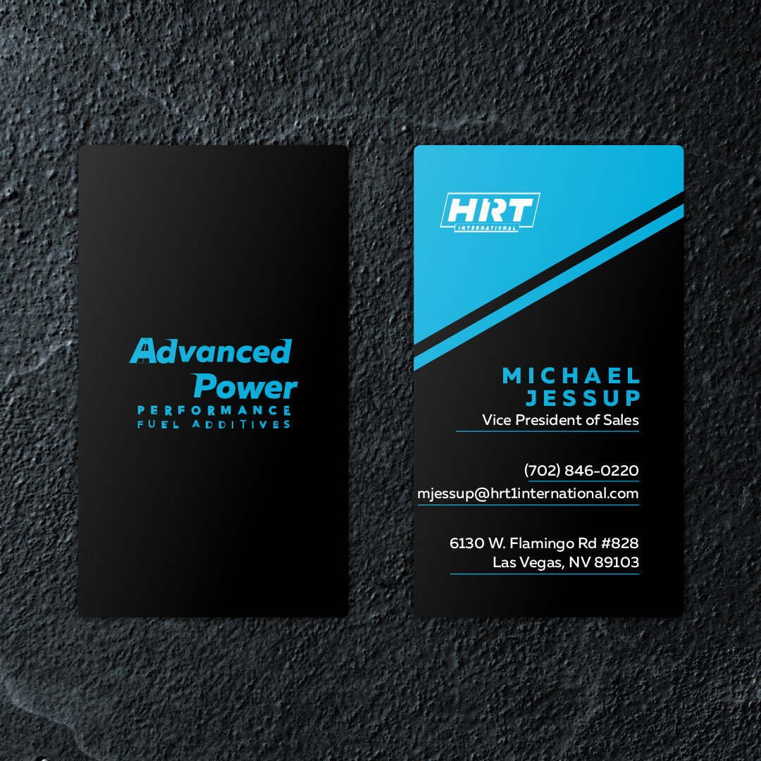
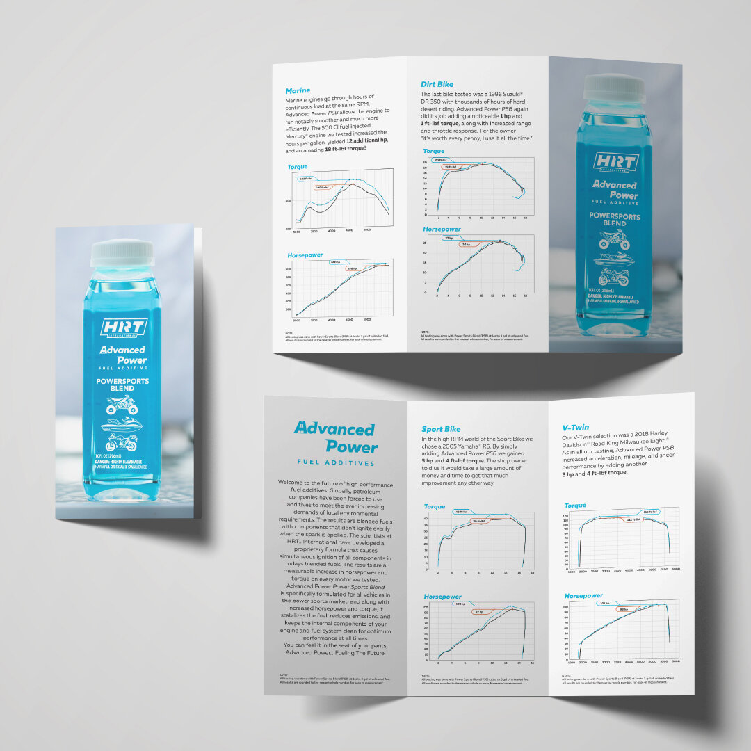
Branding, Graphic Design, Website, Social Media Marketing
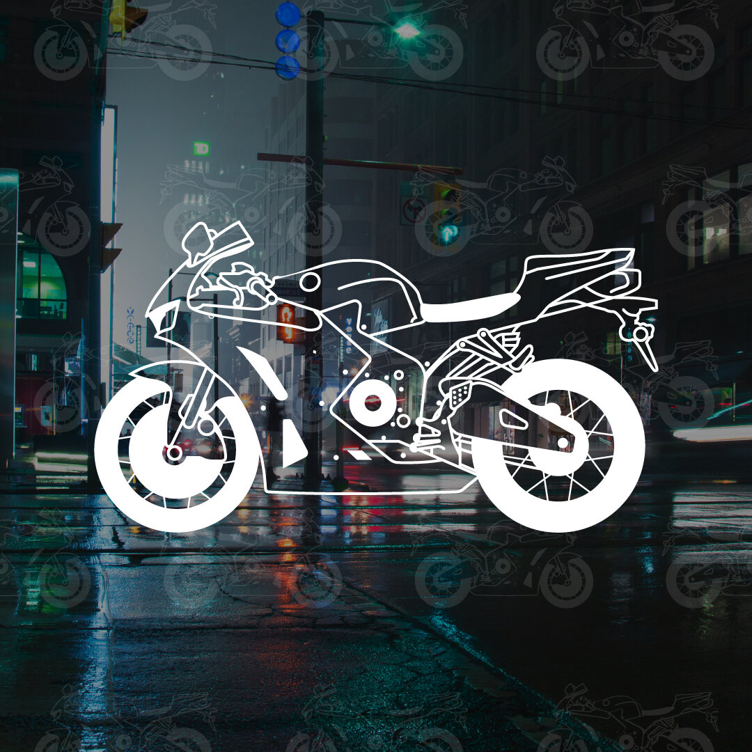
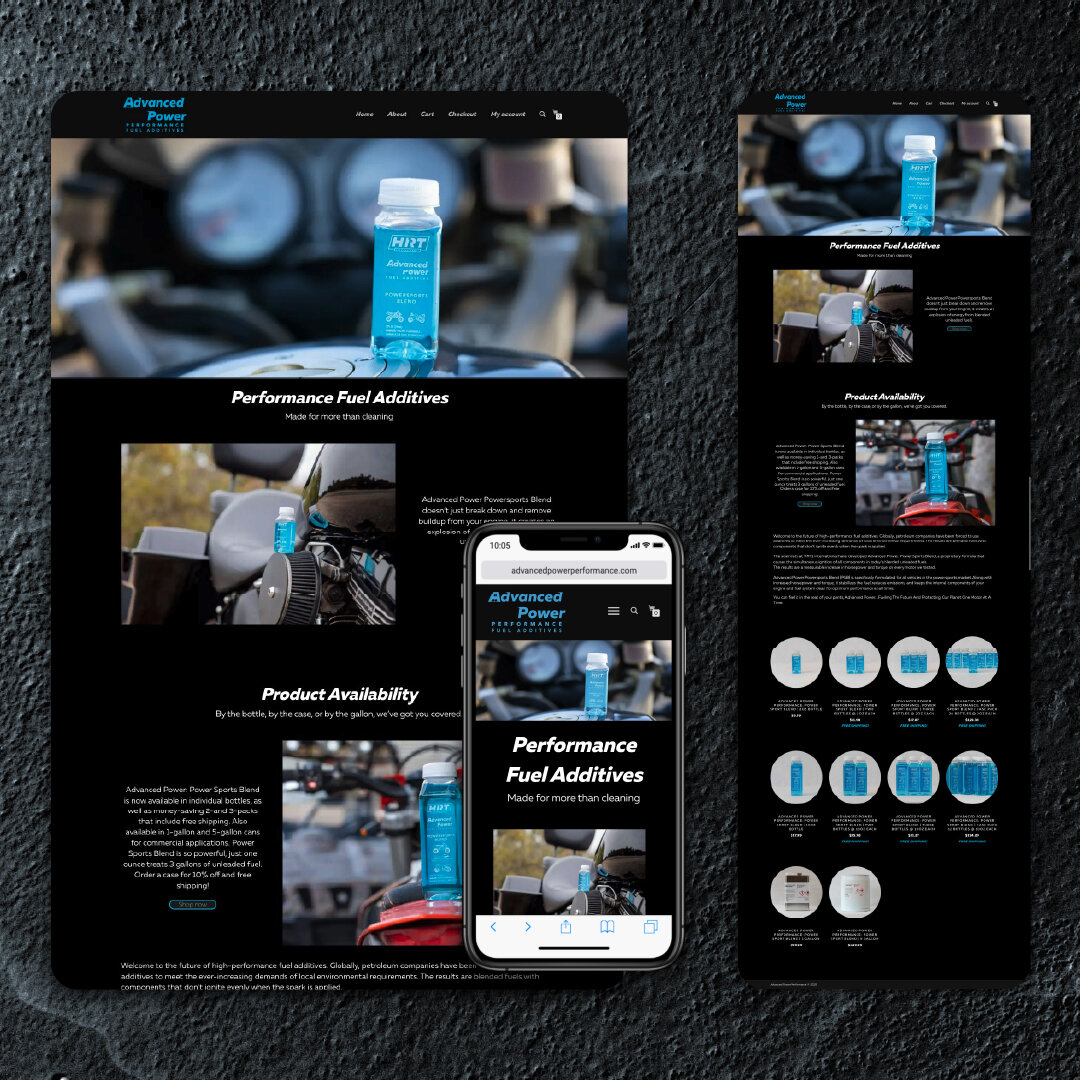
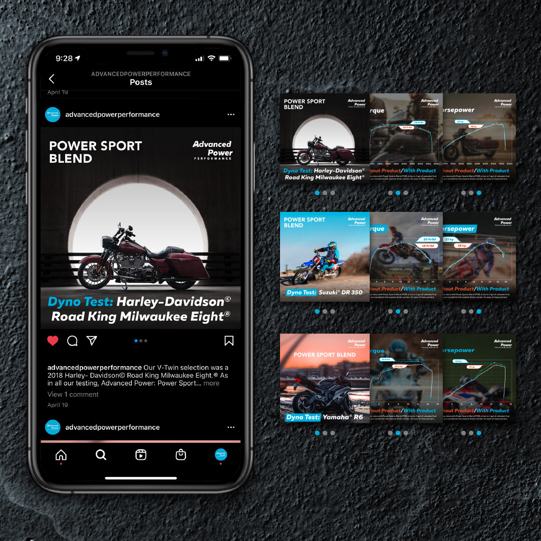
Advanced Power Performance is an all-new Fuel Additive, proven to increase Horsepower, Torque, and Miles Per Gallon. It also reduces carbon emissions and cleans the engine as a by-product.
This brand is designed to communicate a sense of motion and power, while standing out from other branding in its field, which oscillates from extremely bland to extremely frenetic. Advanced Power Performance’s packaging is designed specifically to stand out among the competition by being different in every way, without fighting for attention.
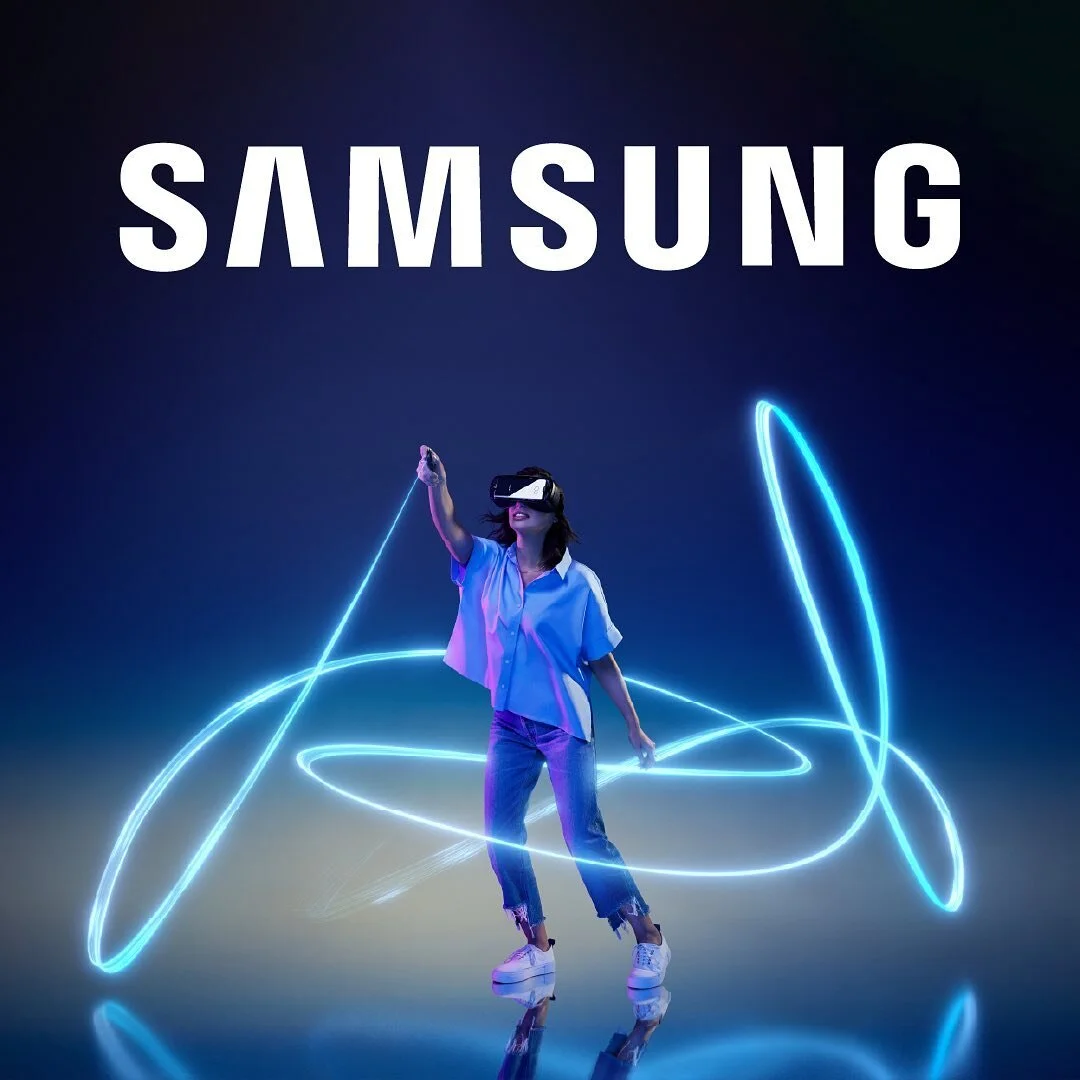
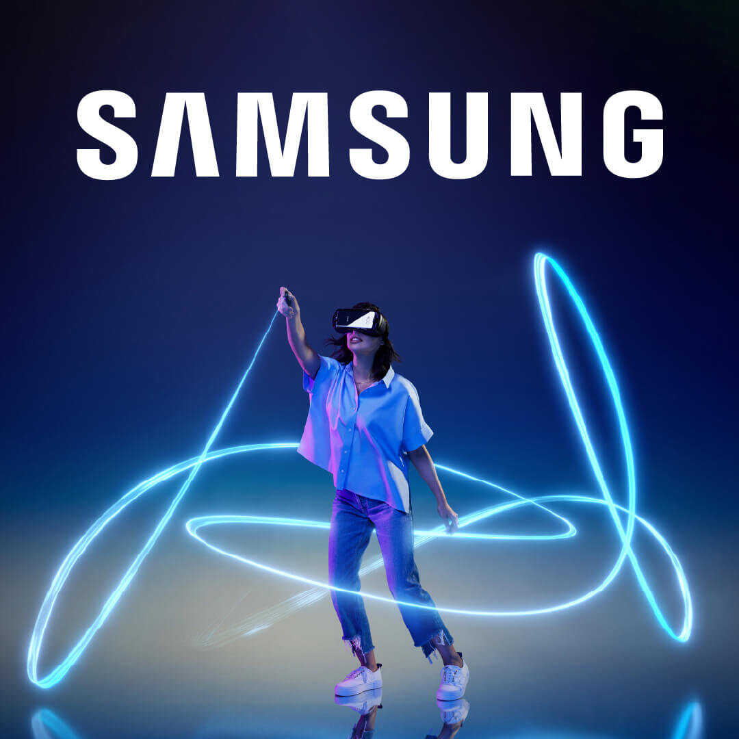
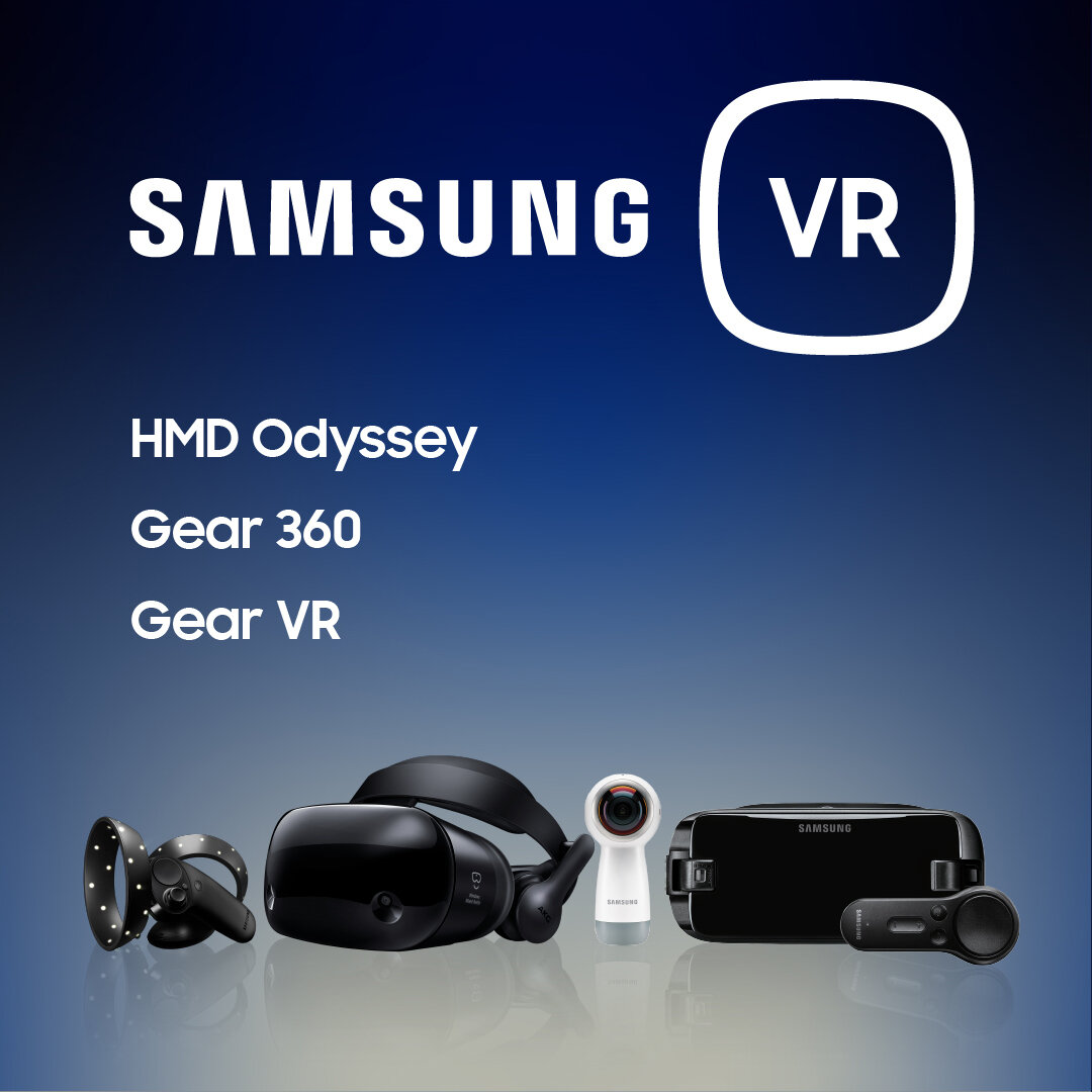
Samsung
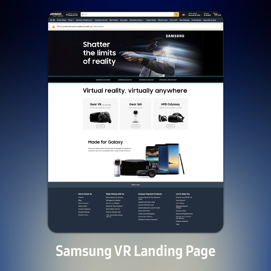
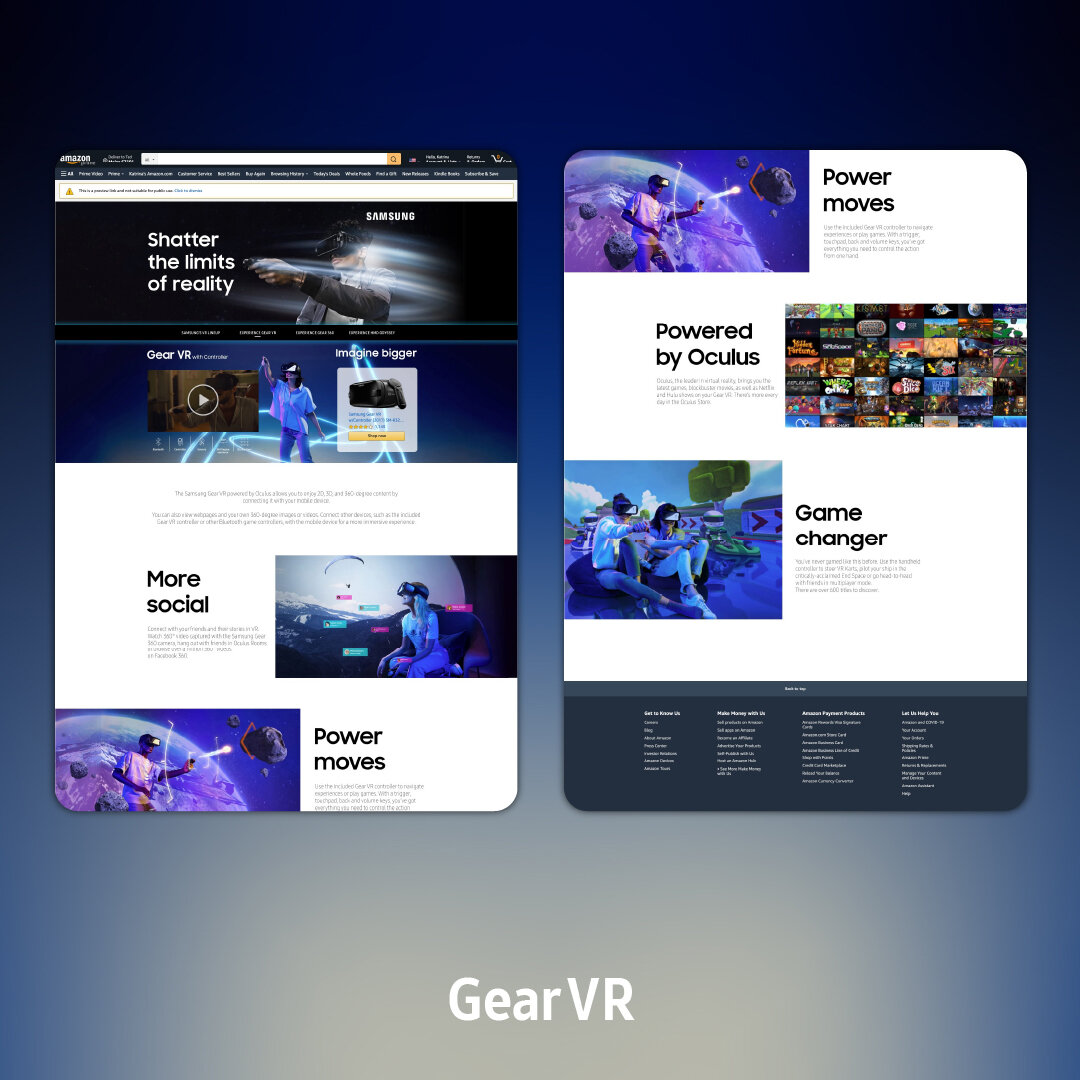
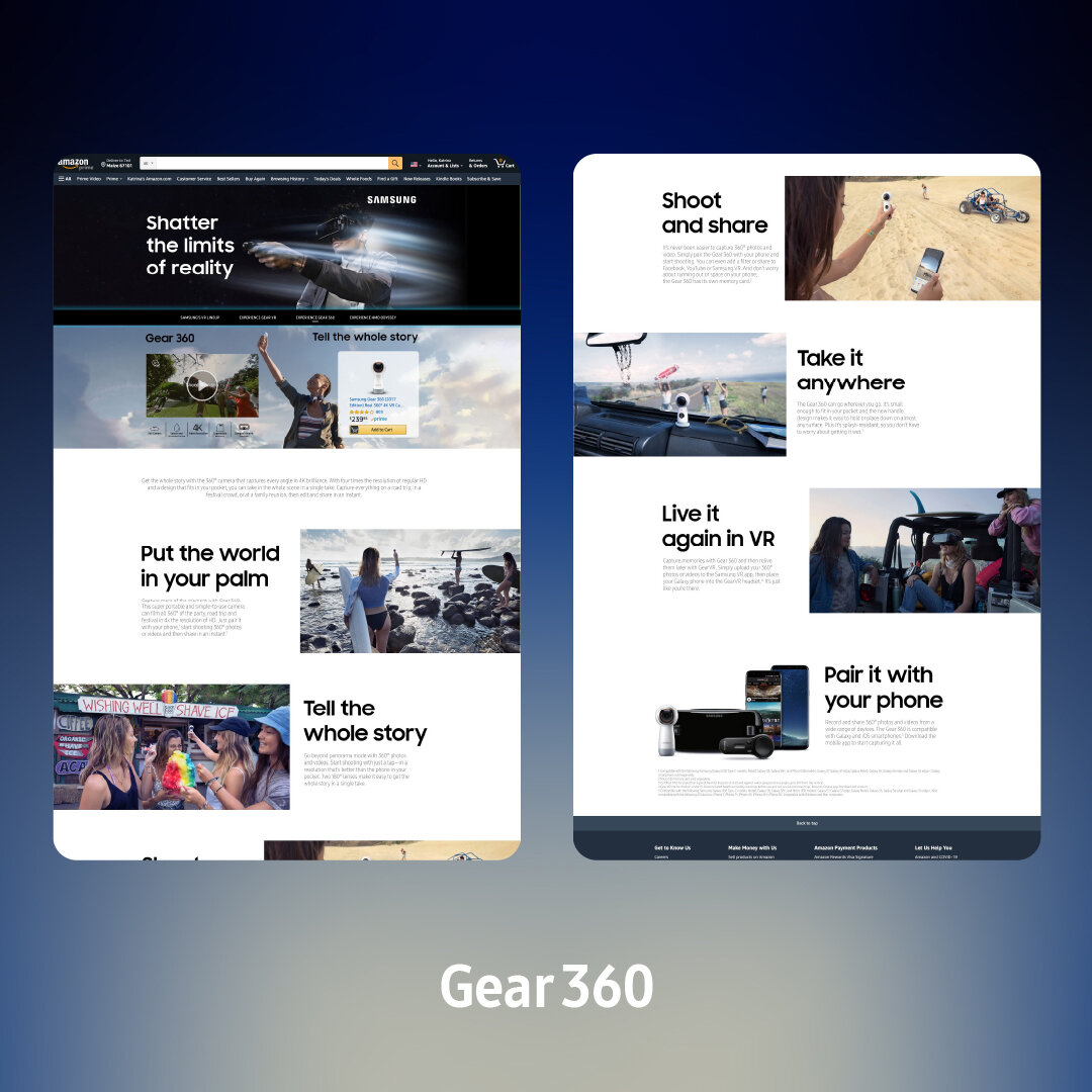
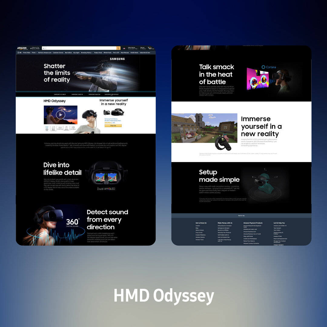
Amazon Product Landing Page (Web)
Global tech giant Samsung needs no introduction. I designed “mini-websites” with them on contract, to promote their Summer/Fall 2018 product push for VR Cameras and Headsets. The AWS Product Landing Page platform that I built these on had many quirks and presented unique challenges that helped me to approach both Web and Graphic Design from a completely different angle than I had before.
While the campaigns have long since come and gone, the (deprecated) preview pages do still exist.
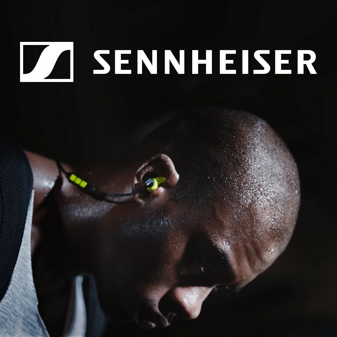
Sennheiser
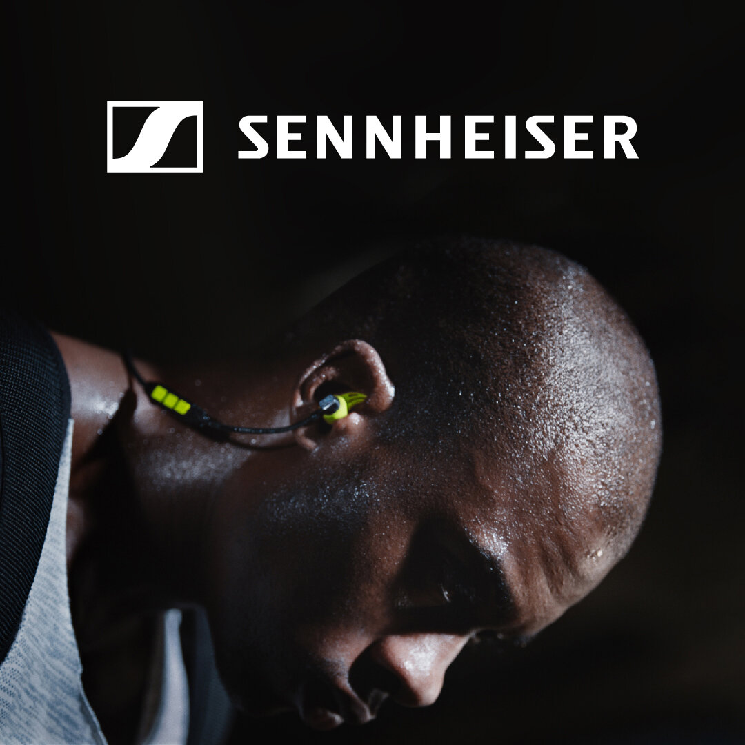
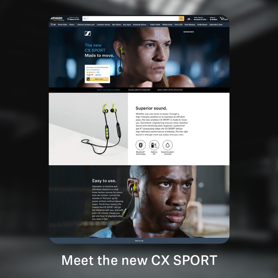
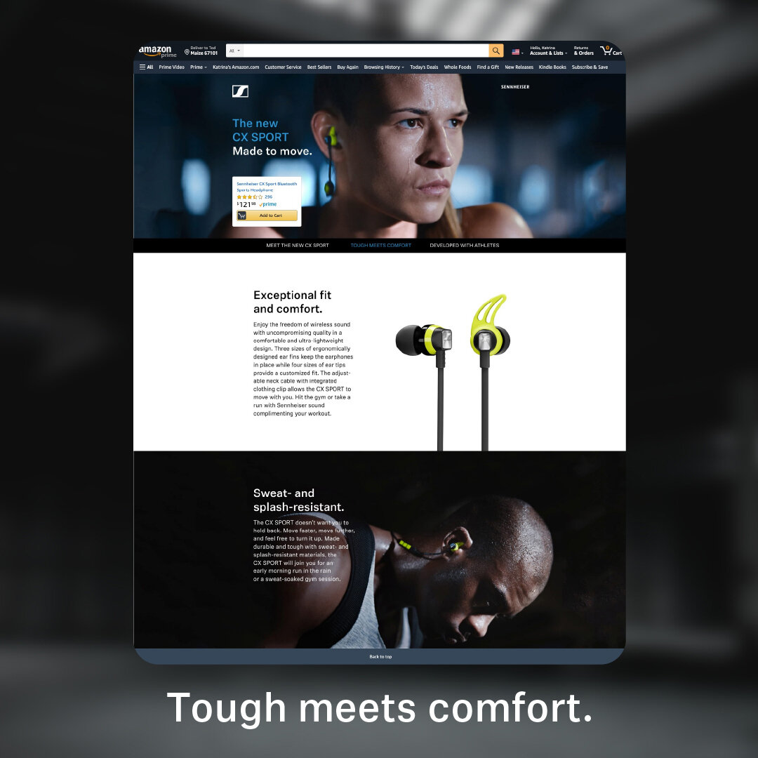
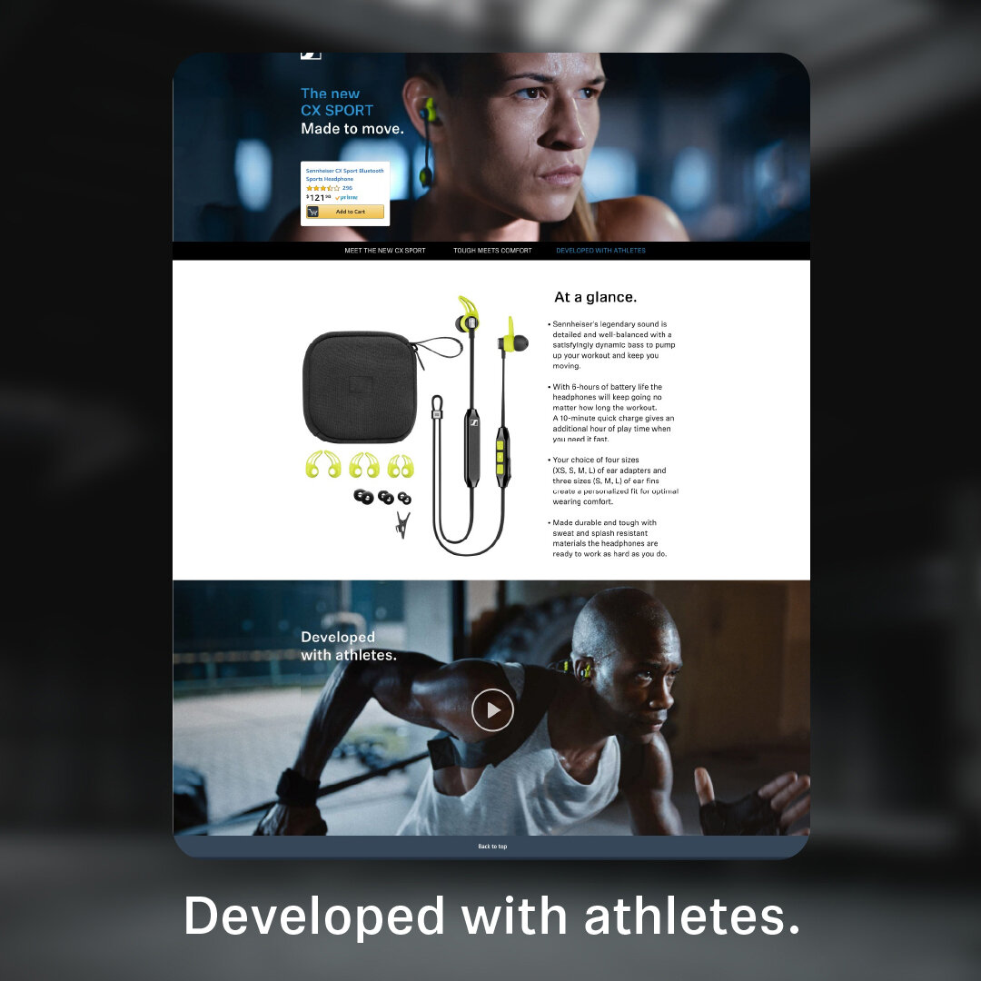
Amazon Product Landing Page (Web)
Sennheiser is a globally renowned designer and manufacturer of Headphones, Professional Audio, and Business Solutions in communication. I have had the opportunity to work with them on a number of campaigns, ranging from call-center headsets to bleeding-edge active noise-canceling headphones and “transparent” earbuds, years before Apple mainstreamed both concepts. On this particular project, I had the pleasure of once again working on Amazon’s very interesting Product Landing Page platform, and finding ways to work both with and around it to reproduce Sennheiser’s austere German luxury brand standards in a project promoting an unusually brightly colored product (for their brand). The unique challenge presented by this product was a tension between the temptation to stray too far in one colorful direction or too monochromatic in another.
While these Sennheiser campaigns have long since come and gone, some (deprecated) preview pages do still exist.
Siemens Gamesa
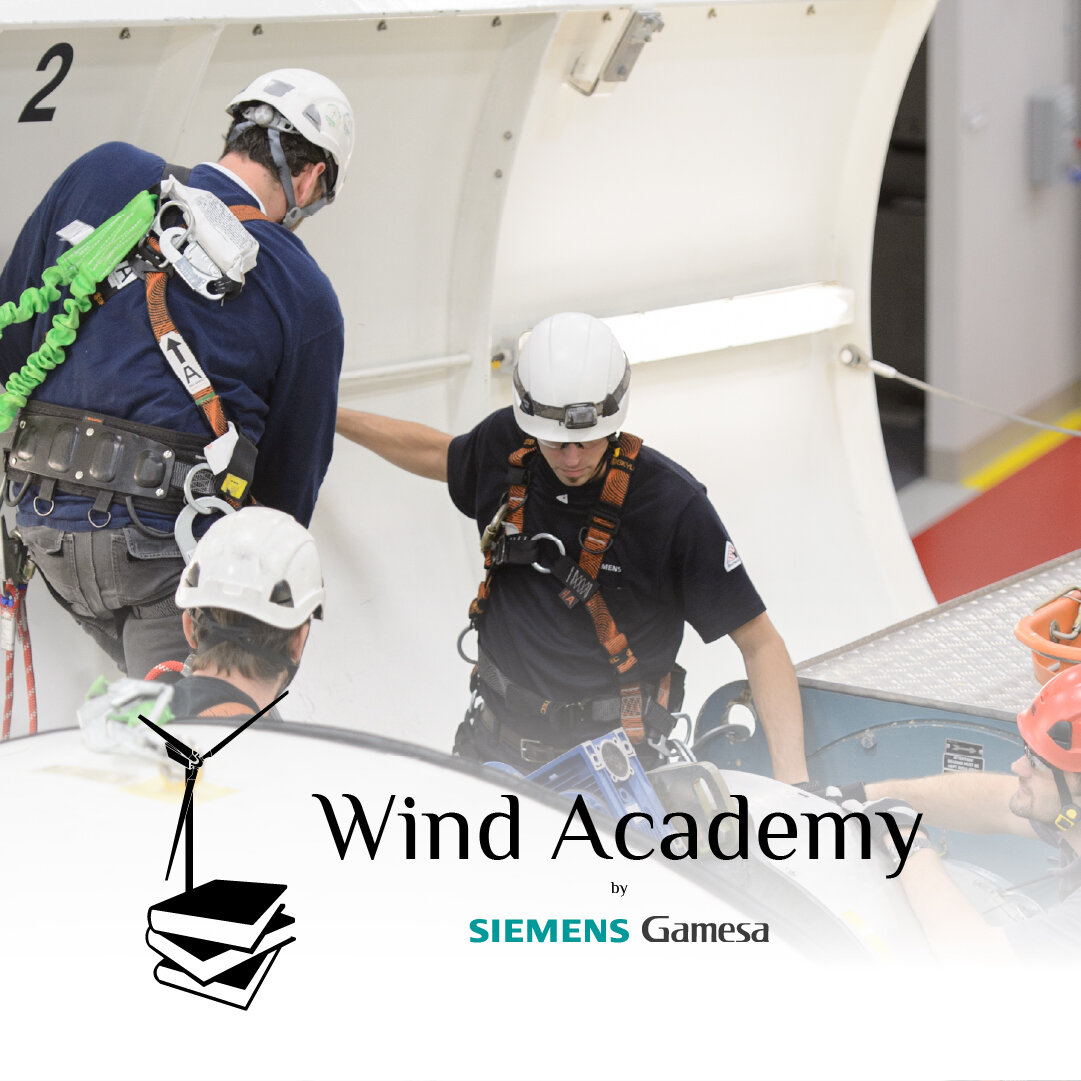
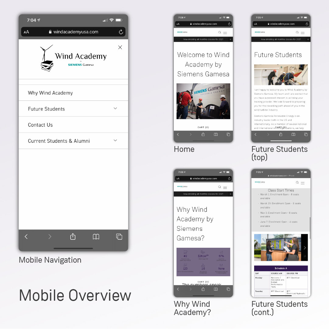
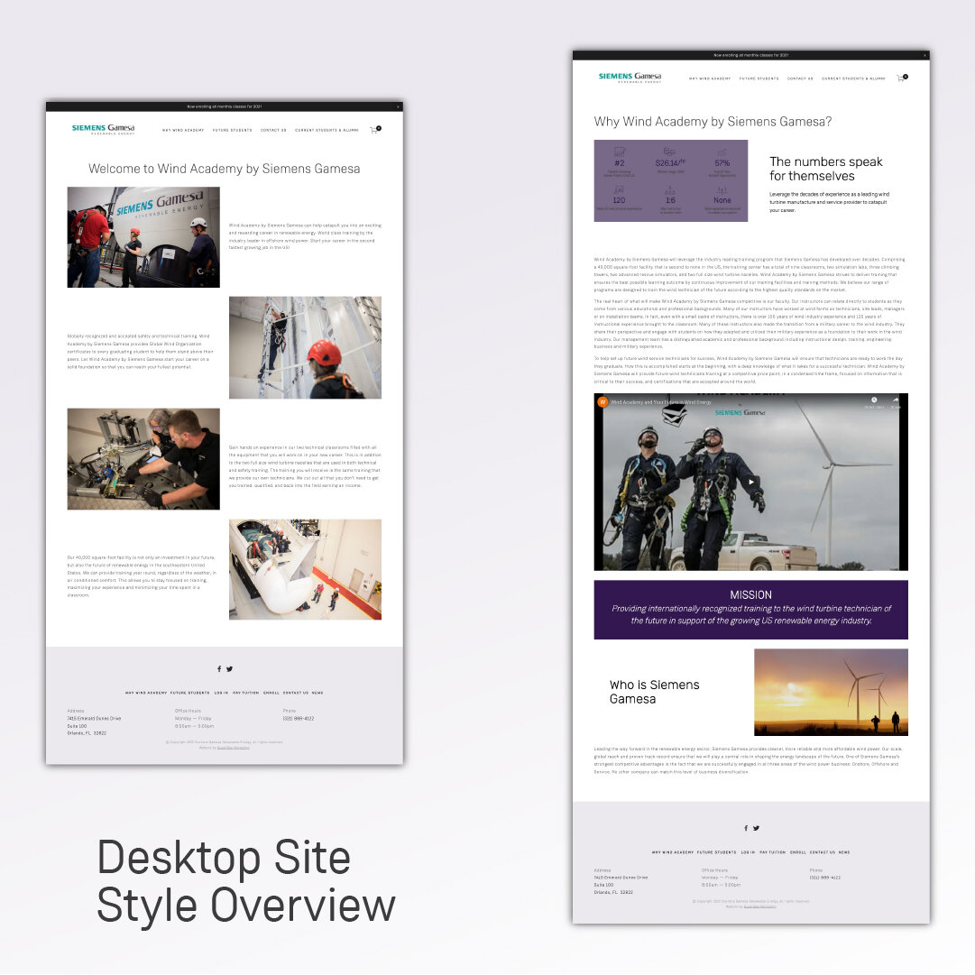
Website
Siemens Gamesa is a global leader in renewable energy and founded one of the only Certified Wind Technician Training facilities in North America. As a one-man Web Department for the marketing agency they selected for the project, I had not only to adhere to an extremely strict and comprehensive set of brand guidelines, but I also had to innovate methods of making Squarespace look and behave like the primary Siemens Gamesa Website, which was built and designed on a completely different platform. I really enjoyed the challenge and seeing my work incorporated seamlessly into a global system was extremely gratifying. It was really fun to work with a Fortune 500 again, and like any other client, I trained them in the use of their site when we were done!
Women Repurposed
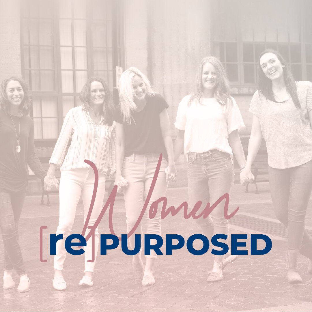
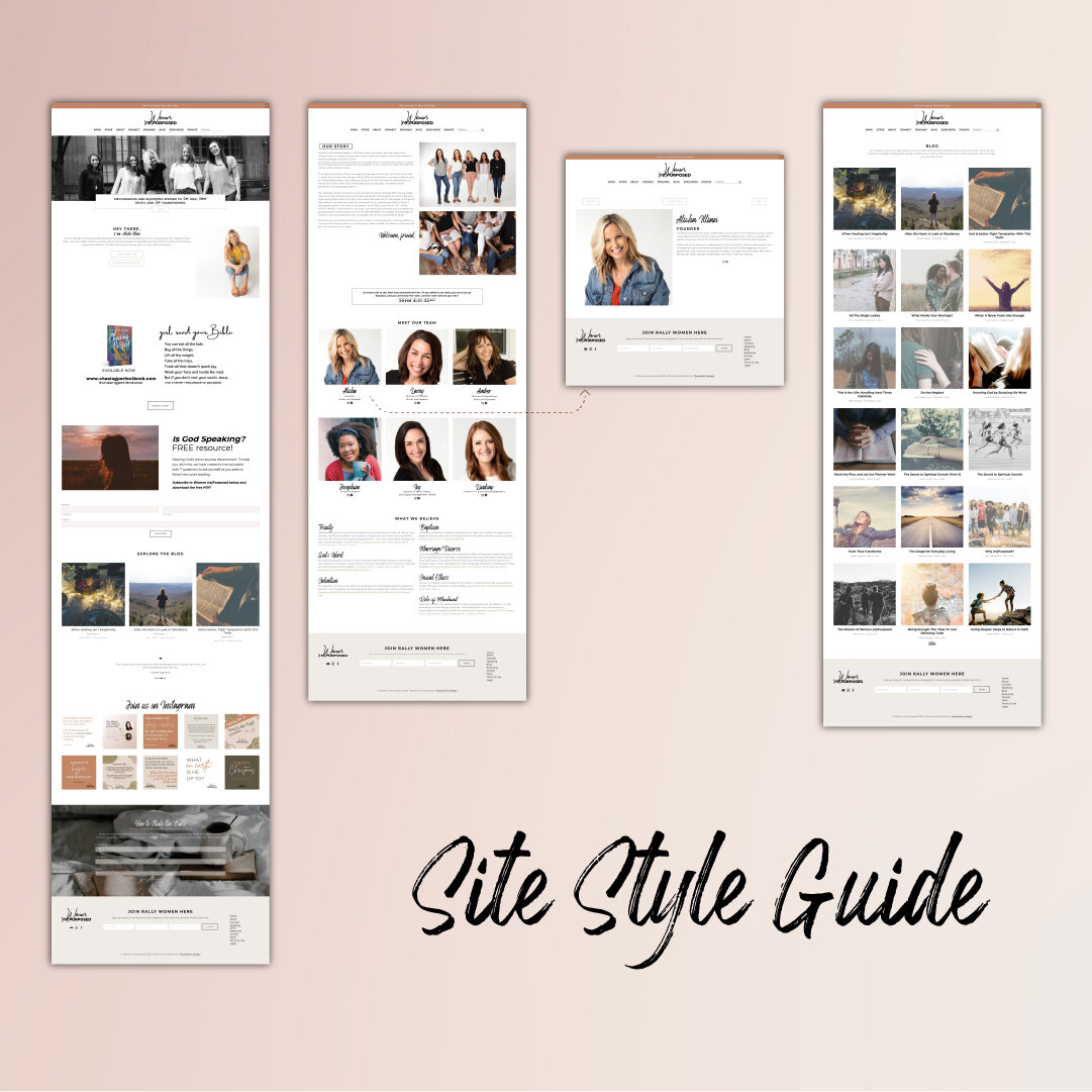
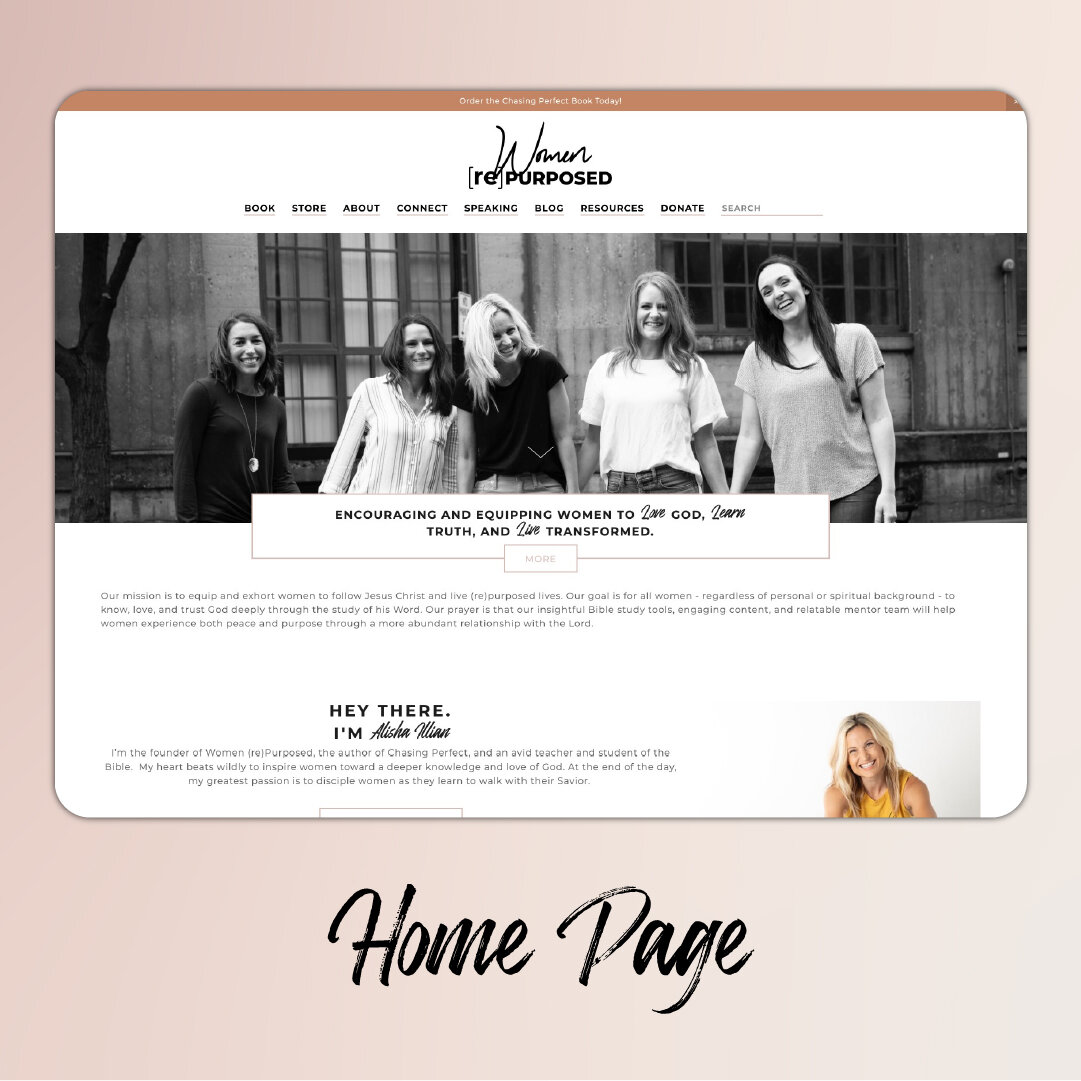
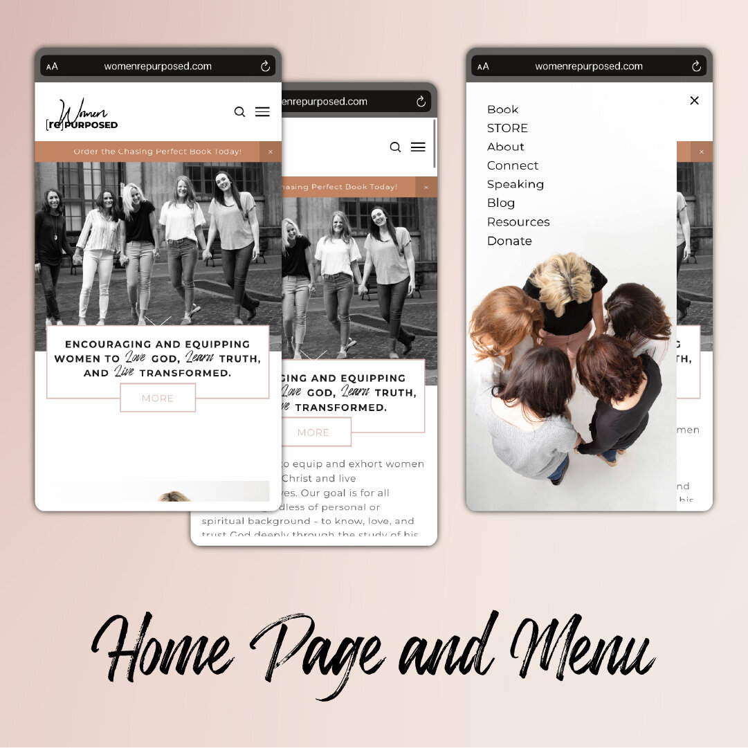
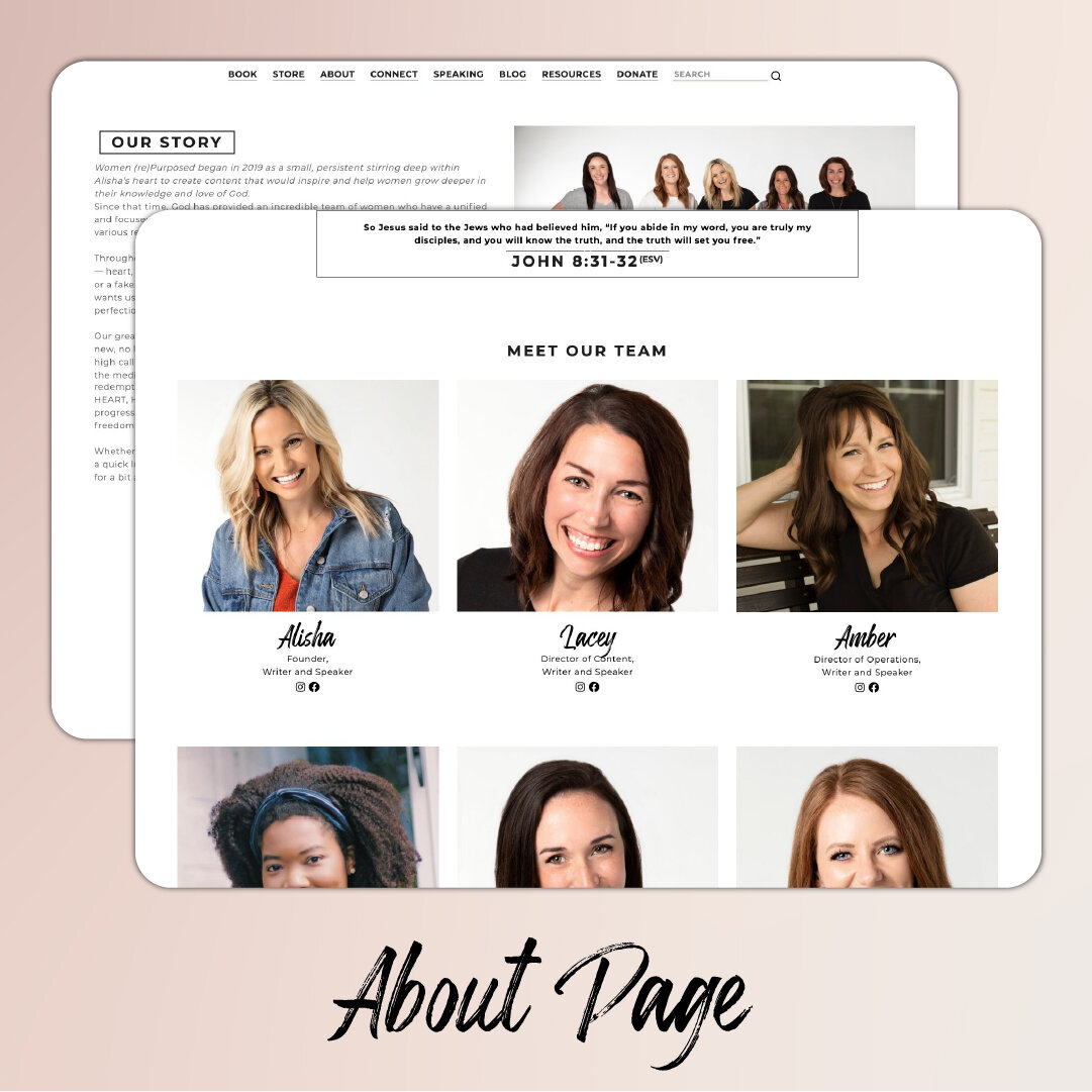
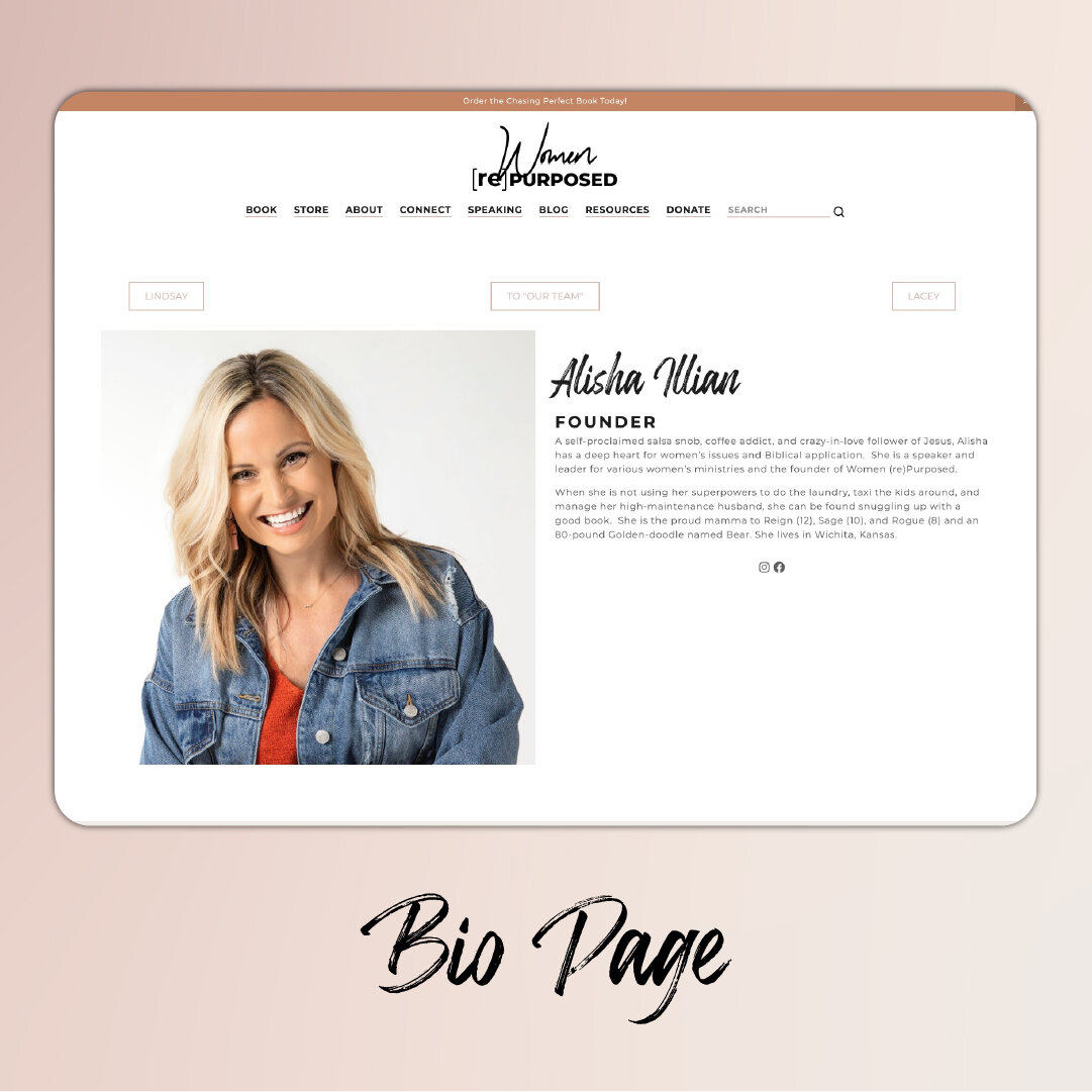
Branding and Web Design
Women Repurposed is a lifestyle ministry for women, with an emphasis on Biblical literacy, community, and identity. This was a delightful opportunity to work with an extremely hands-on client with a collaborative approach on a site that both fit a niche and broke a few molds along the way. Fun Fact — Though they had no idea at the time of signing the initial contract, I had taught the Clients’ children the previous year!
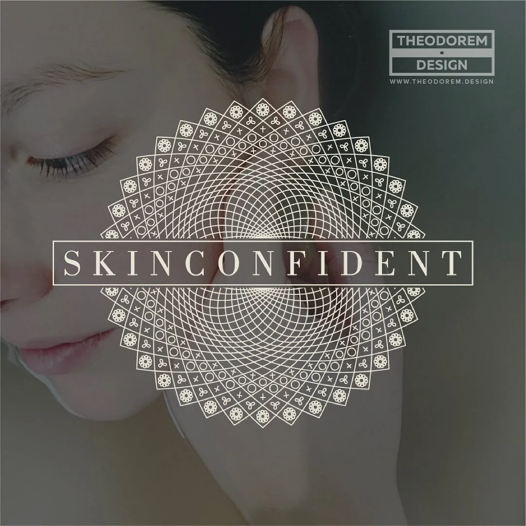
SkinConfident Aesthetician
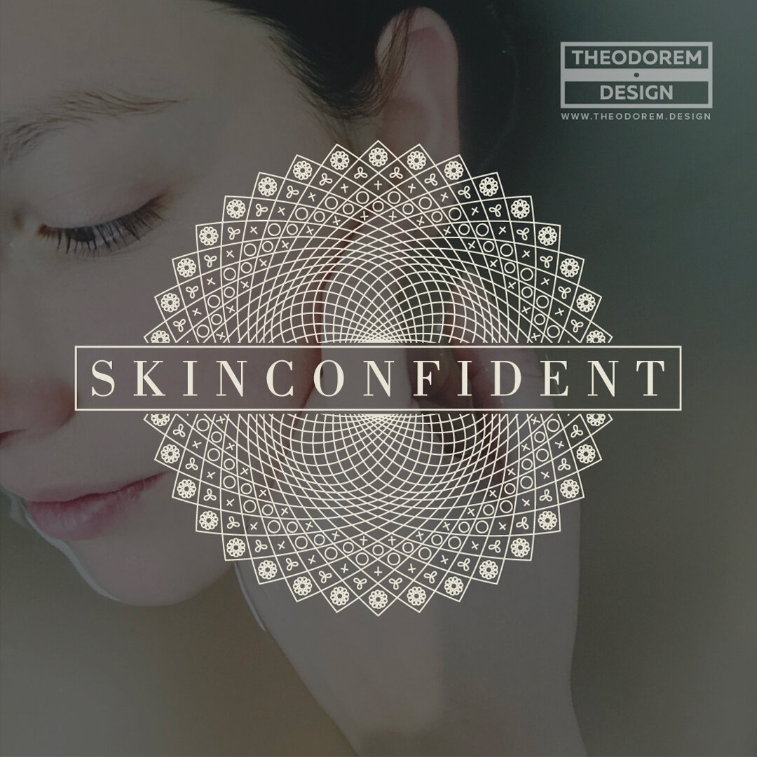
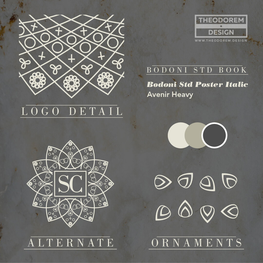
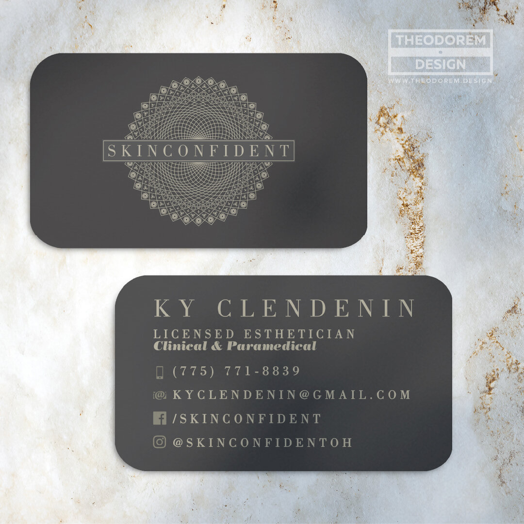
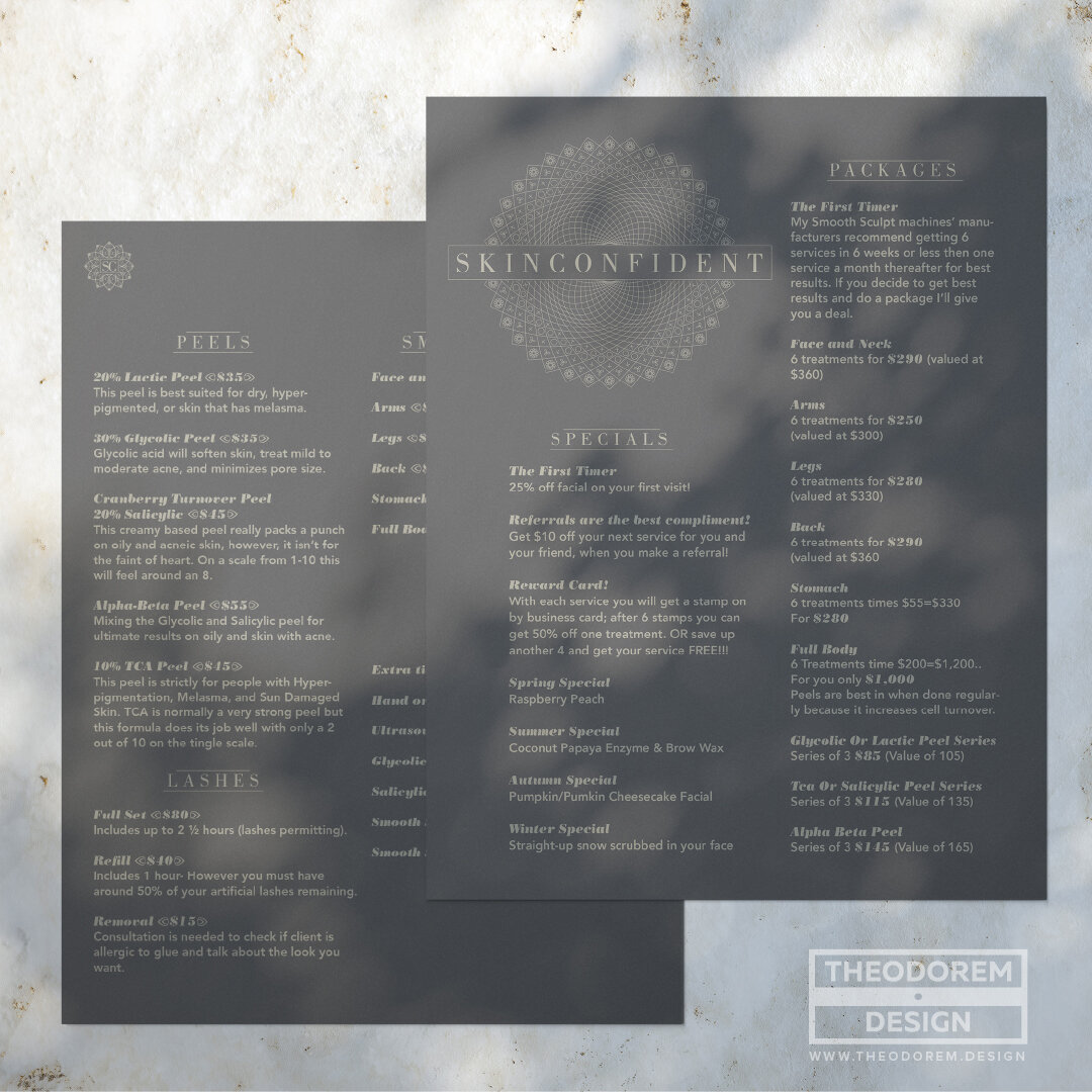
Branding
Skinconfident is the private practice of @kyclendenin, a Licensed Clinical & Paramedical Esthetician based out of Columbus, OH.
Ky asked for a Christian-influenced Mandala, which is notable in that the origin of the Mandala (if not all of its modern applications) has its roots in Hindu symbolism. The research involved in the development of this brand was very rewarding and interesting, and as is the case with so many of my clients, Ky has become a dear friend over the years.
Nurturing Hearts
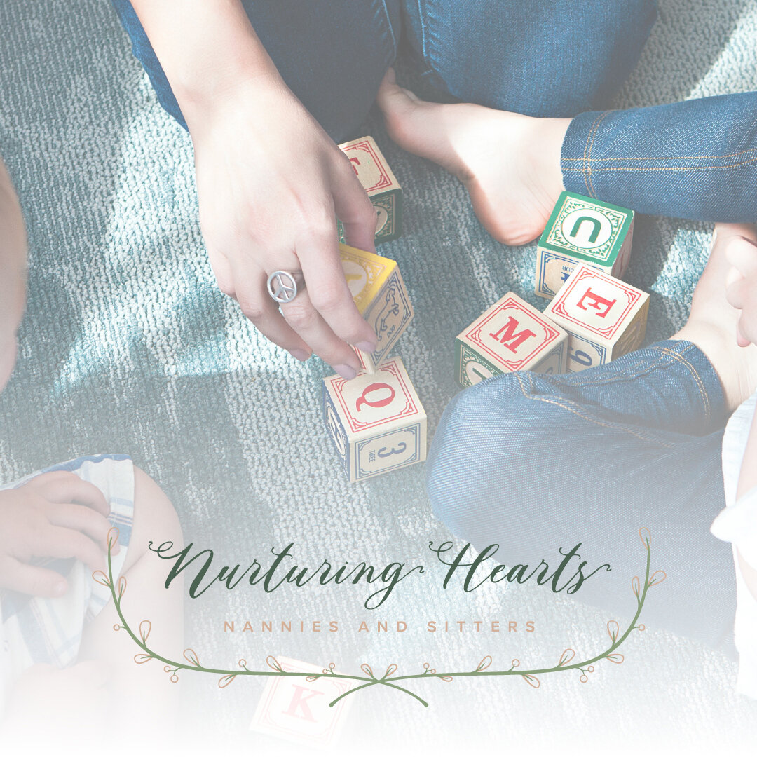
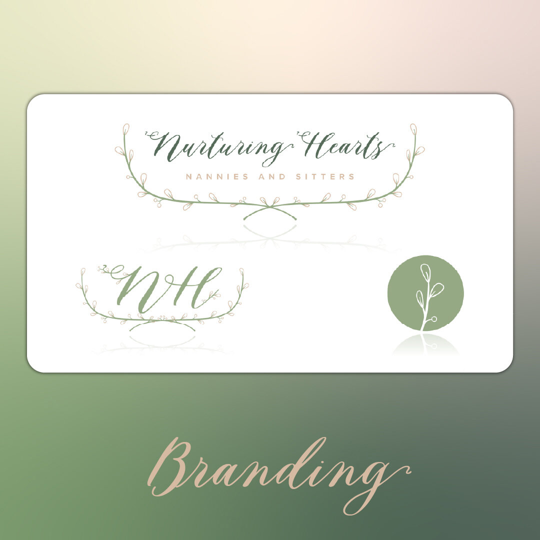
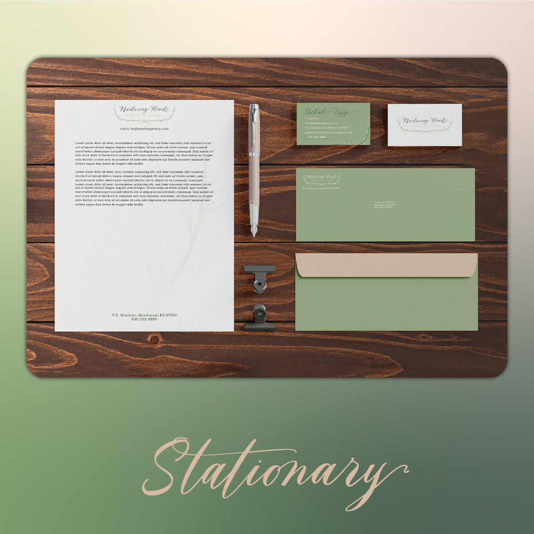
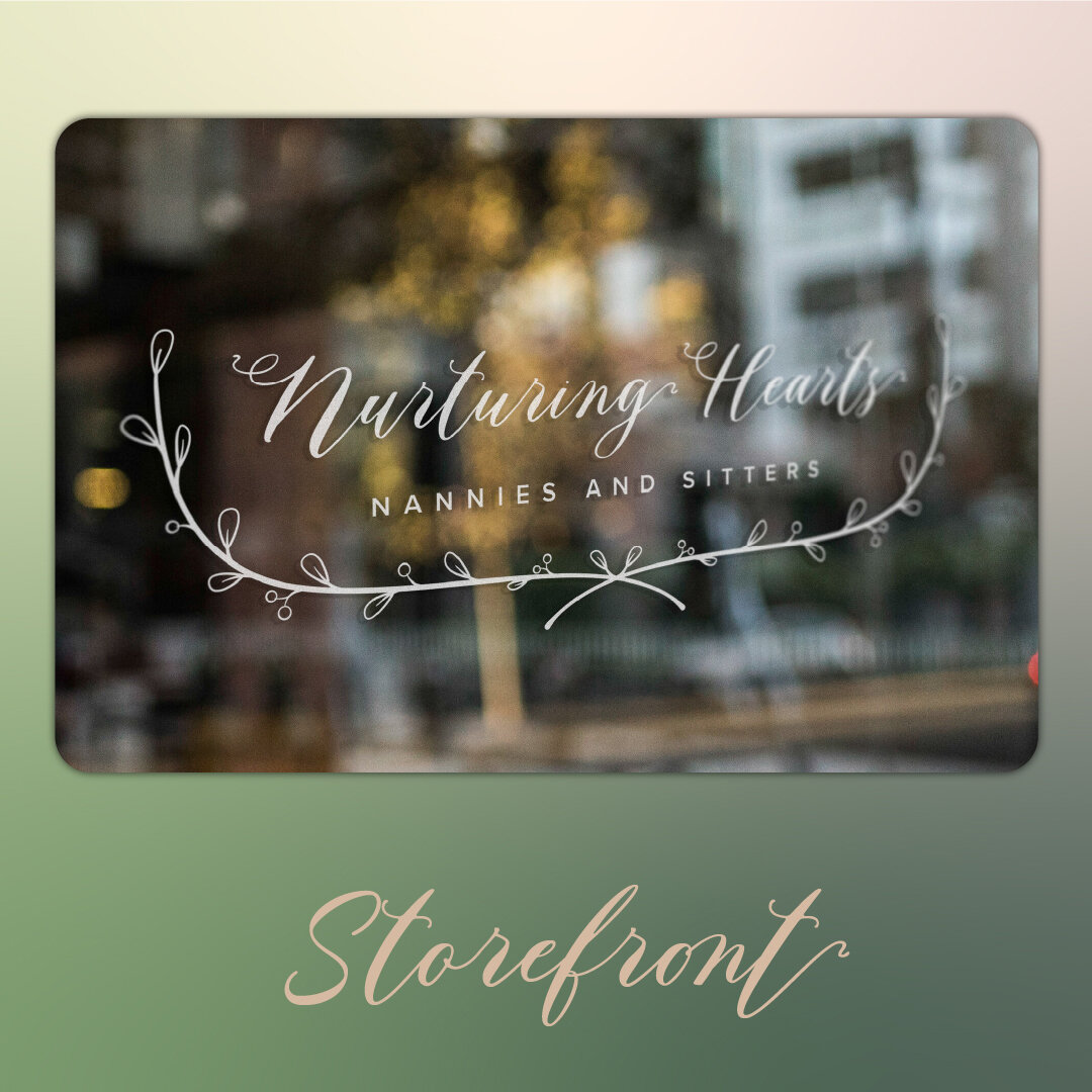
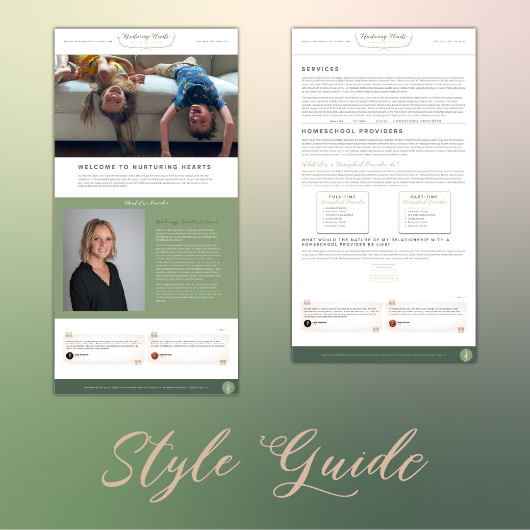
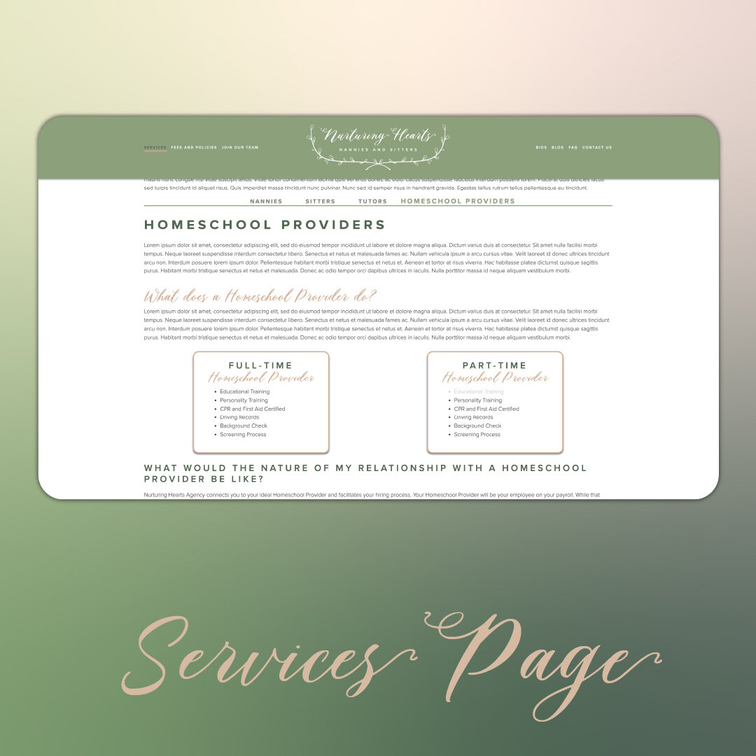
Branding and Web Design
Nurturing Hearts Nannies & Sitters Agency specializes in connecting families on the move with top-tier childcare and education providers, in both long- and short-term capacities. This branding package was accompanied by a brand-new website. This logo is designed to evoke a sense of tenderness and thoughtfulness which guides and reshapes what naturally grows wild while encouraging vibrant growth.
The branches simultaneously represent children growing into shape, and the encircling arms of a trusted caregiver.
Coordinated by Lauren
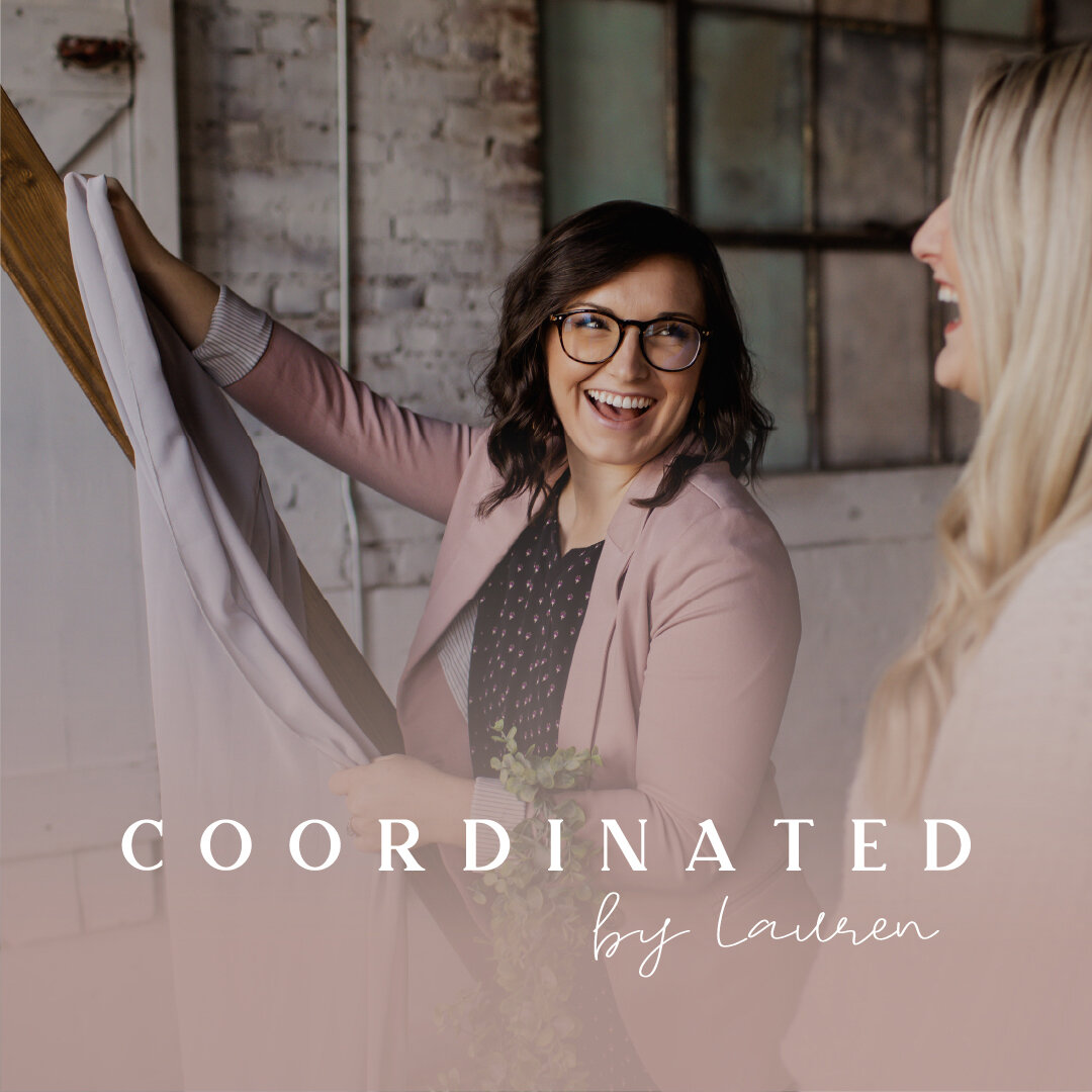
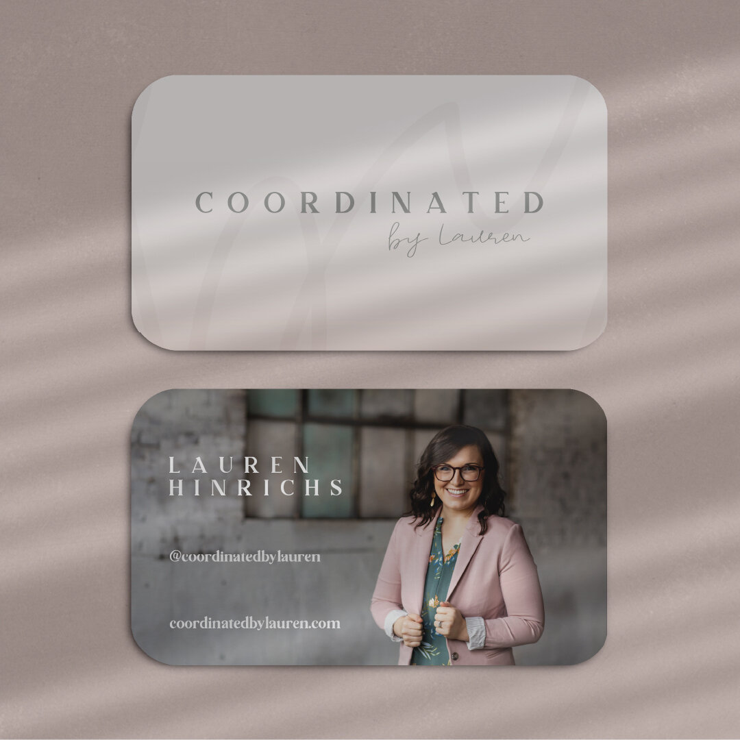
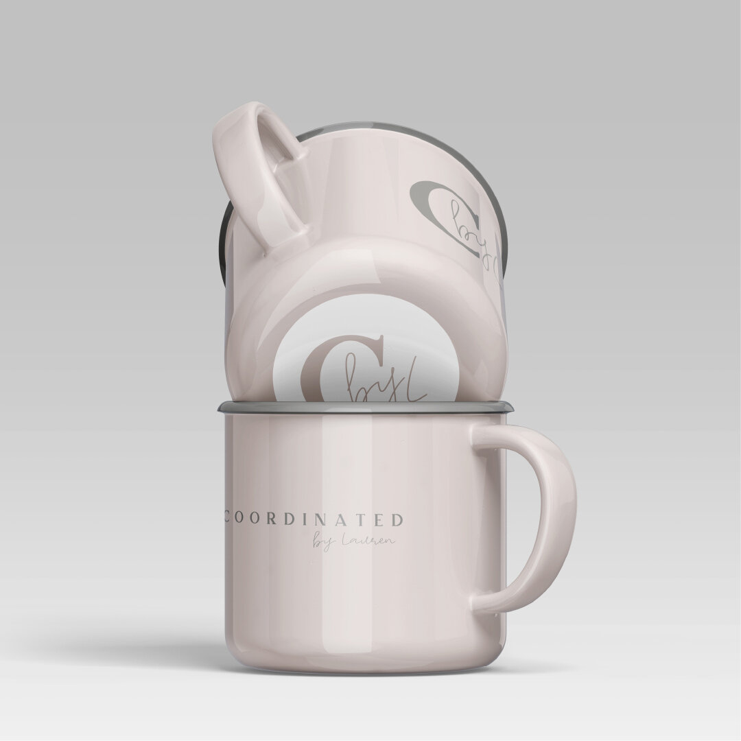
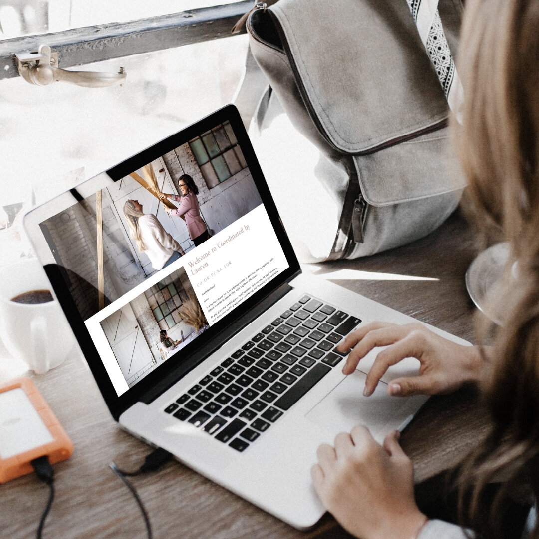
Branding and Build Your Own Website
Coordinated by Lauren is a Northwest Arkansas Wedding Coordinator. Lauren describes herself as “more of a lighthouse than a pilot:” advising and guiding Brides as they plan their special day. When the wedding day arrives, Lauren goes into high gear to clear a path for the bride’s wedding day to go exactly the way she wants it to.
The Coordinated by Lauren branding package was unusual in that the client specifically asked to not have wedding rings involved in the typography or logo in any way.
The capitalized characters of the word “COORDINATED” communicate confidence, competence, and strength. The serifs and design of the font chosen also add a sense of culture and style-awareness that speaks to brides across a broad gamut.
The width of the characters in “by Lauren” give this part of the logo a completely different tone that is more “human,” welcoming, and communicates to brides that they will get to rest in the confidence that Lauren’s coordinating expertise provides.
@coordinatedbylauren
Thanks to her newfound skills, Lauren has informed me that www.cordinatedbylauren.com is currently being rebuilt.
Upstaged by Amy K

Branding
Upstaged by Amy K Stages upscale homes for tours by potential buyers. This client took an adamant stance of wanting to avoid overt wordplay and distorted text, which of course required a more sensitive and abstract approach to reaching the best solution for the brand. This logo marries the elegance and humanity of Amy K’s Staging skills with the structured and orderly process used to help buyers command top selling-prices for their homes.
BARC Tree Care

Branding
BARC Tree Care specializes in the management, restoration, and removal of trees that have become dangerous to homes and other structures in the central Kansas area.
As with all projects, I took the time to learn everything I could about the client’s company history, specialty, and industrial context. The “A” is the result of extensive study into the species of trees native to BARC’s area of service, and the leaf inside is based upon the Kansas State Tree, the Populous Deltoides, more commonly known as the Cottonwood. This logo gives the viewer an immediate sense of what BARC does, even before reading the name, and combines strength and sophistication in a way that no arborists in their service area can compete with.